THE CAMPAIGN
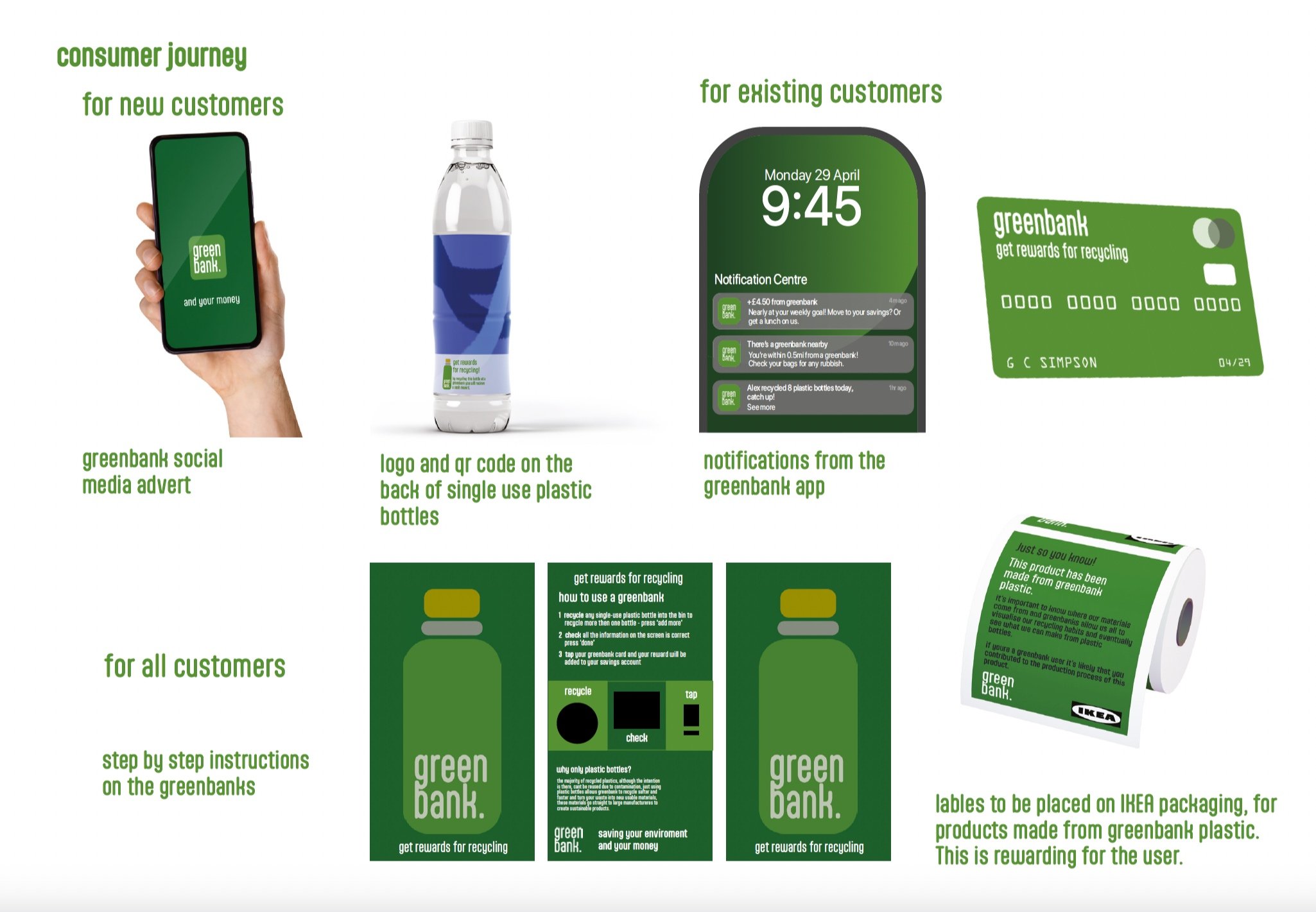
Placed in local cities and parks, Greenbank is an online bank that rewards recycling by using a bottle deposit system, the recycled material produced is used in IKEA products, making the company more sustainable, and rewarding those that make it happen. Greenbank’s promotion follows the consumer throughout the entire process from the single use plastic bottle to IKEAs packaging, the user stays informed and directed.
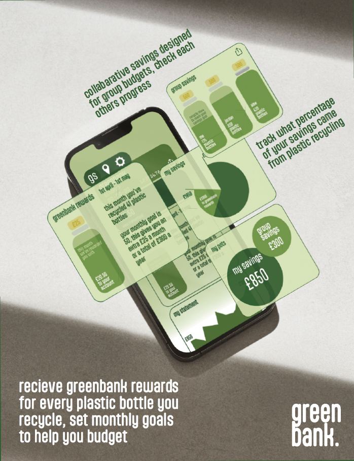
The Greenbank online app focuses on saving the environment and your money, two very key topics in current society, with both the UK recession and the eco conscious movement being rife. IKEAs slogan is the wonderful every day, which doesn’t feel very wonderful with these issues plaguing our country, instead of promoting excess consumerism for short term gratification, Greenbank promotes long term changes fuelled by short term gain- money.
Despite the heavy reasoning, Greenbanks branding is light-hearted and has a simple cartoon style, the logo being on the back of all single use bottles makes the campaign transportable as the user can take it anywhere with them, the app notifies you whenever you’re nearby a Greenbank and reminds you to recycle, its an easy process and will influence many people to make recycling a habit.
BRAND IDENTITY
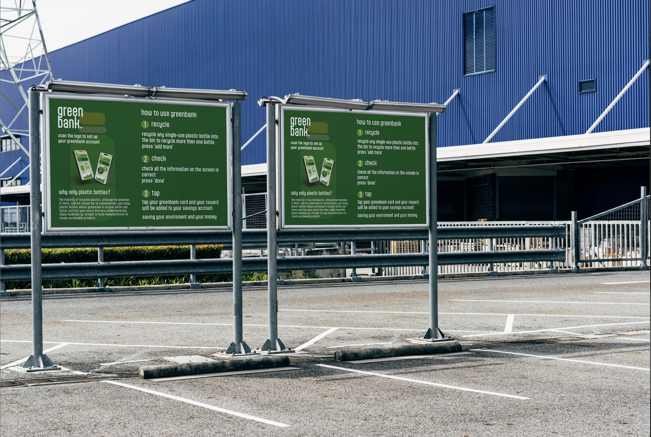
The name Greenbank is a double entendre, it refers to a typical money bank and the physical recycling deposit bin around city centres. The chosen typeface is very friendly and direct, Greenbanks can be used by anyone, recycling and saving money is a rewarding process and the aptly font is confident and encouraging.
Within the promotional animation, the bottle icon and secondary logo is made up of the Greenbank debit card and a pound coin, the logo and animation reflects the action of finding money within plastic bottles.
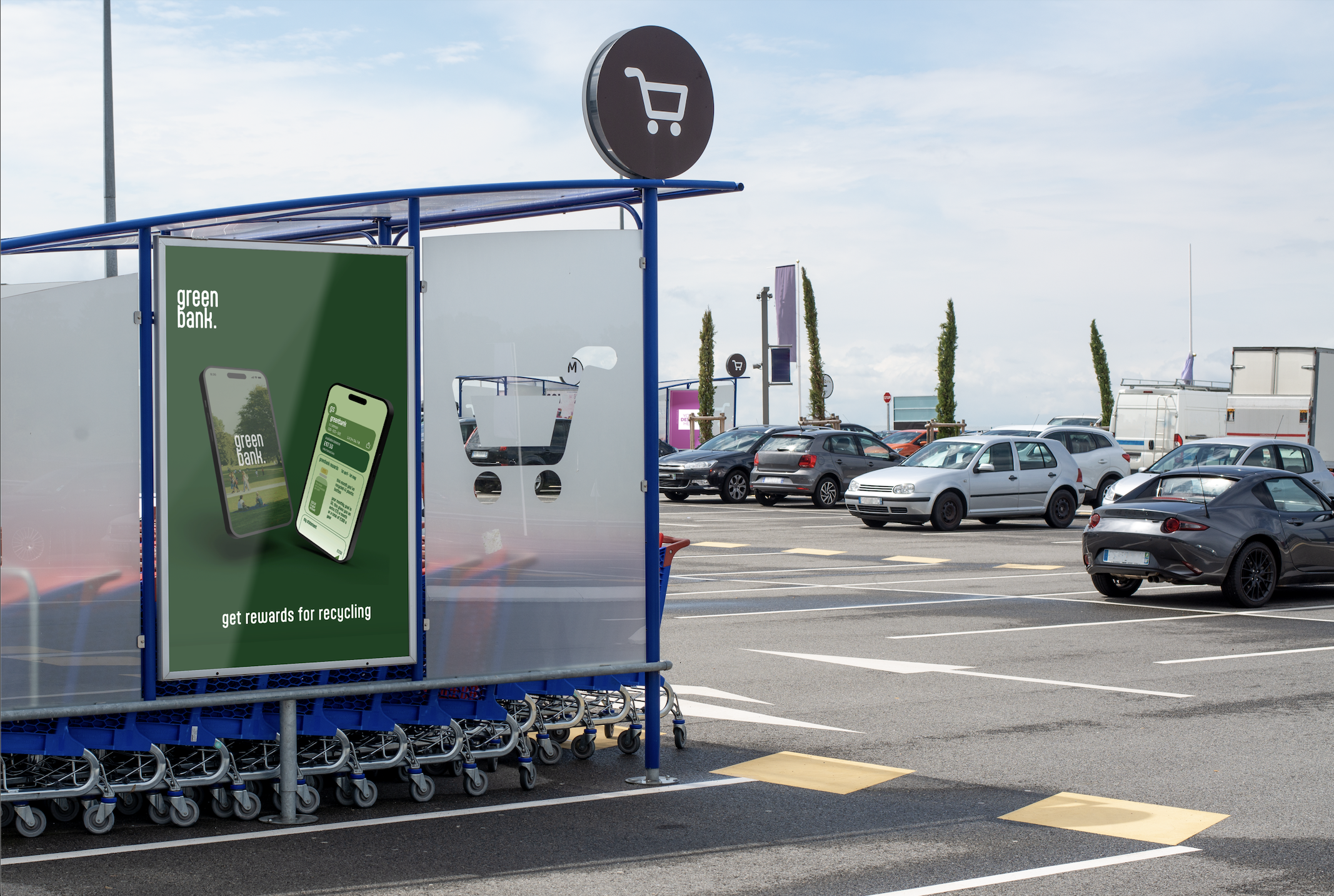
The deliverables of this campaign cover a range of consumer touch points, such as clear labels on plastic bottles, billboards, the location of the Greenbanks, the online adverts and the sticker placed on current IKEA packing that explains the scheme. With IKEA as the sister brand, Greenbanks will be placed at the entrance of every IKEA location with supporting billboards in the car park.