
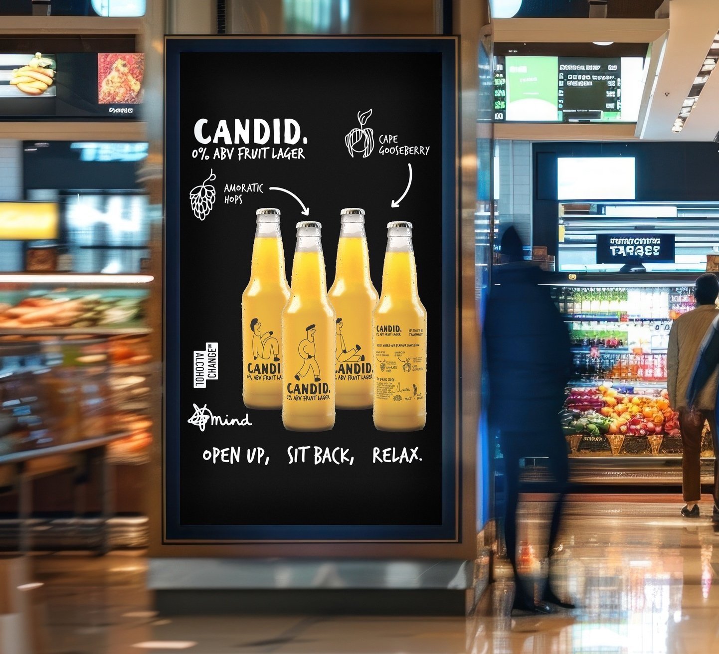
CANDID’S brand identity and open up campaign was curated to encourage safer choices around alcohol and mental health
BRAND IDENTITY
When researching the brief, I discovered the reasons why consumers do and don’t drink, the most common answer was due to suffering mental health. Candid is partnered with mental health and substance abuse charities to support the product demographic, and allow the consumer a sense of pride with every purchase.
The name candid was chosen due to its multiple connotations, the most focal being; to be honest and tell the truth, especially about something difficult and painful. This describes the process of recognising a mental health issue and making a significant change to combat it.
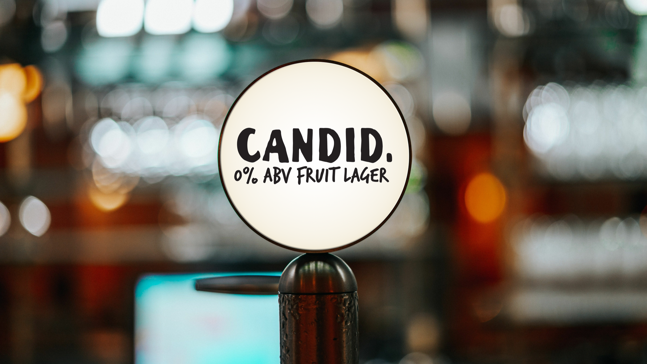
Candid can also be interpreted as being honest, frank and sincere, this is reflected in the brand identity with confident bold sans serif typefaces and (literally) transparent characters and ingredient lists. But its the small details that really cement this concept, the title of the I in Candid is replaced by the foot of the character, this demonstrates confidence as the character is standing on their decision to be candid. The bottle caps read ‘open up’ to encourage a candid conversation over the drink.
A merchandise line was also designed for bartenders and consumers to wear, this provides further promotion for the brand, supports the cause and demonstrates the pride that was mentioned within the brief.


